


To my bewilderment, I happened to glance up at my TV and saw this on the screen a few minutes ago:

What in the heck? They are making Obama look reasonable with this stupid graph and Trump look like the big spender. There’s no context whatsoever to explain this. Also, they skipped 2018 and went straight to 2019 which hasn’t even happened yet.
As you can understand, I feel compelled to set the record straight on this. Here is the truth between these two presidents:
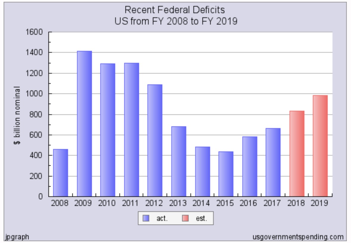
Note the red bars are the projected estimates for this and next year.
Now look, I’m not saying Trump is a deficit hawk by any stretch. Clearly he’s not and he should be criticized for it.
But the CNN graph is completely unfair to Trump. Obama had the highest federal deficits of any president, ever. Obama by comparison makes everyone look like a fiscal hawk compared to him, which is why it’s so insulting for CNN to show a graph like this.
Here’s the interview with Ken Buck:
[wpvideo 6QgYuH3V w=755]
Since when does CNN care about deficits? The former Obama admin host here is arguing that the tax cut is creating this deficit problem for Trump in this interview with Ken Buck, because we’re reducing what we bring in. Thankfully Buck corrected him, explaining to him that it is SPENDING that creates large budget deficits, not letting the taxpayer have more of their money. Also the tax cuts with spur growth, something the democrat-controlled media never likes to admit.